Project Overview
Before customer dissatisfaction snowballs into churn, what if you could spot the early signs from support tickets, health scores, and revenue trends, all in one dashboard? In this tutorial, you will build a customer health dashboard that integrates data from Zendesk, Hubspot, and Stripe to track key metrics like support tickets, average MRR (Monthly Recurring Revenue), health scores, and churn risk, all in one unified view. The goal is to help customer success teams, product managers, and sales leaders spot early warning signs, improve retention, and reduce churn. This dashboard delivers real value for:- Customer success teams focused on proactive churn prevention
- Product managers looking for deeper insights into account health
- Growth and revenue teams aiming to maximize customer lifetime value and reduce churn costs
The Tools We Need
To build this customer health dashboard, we’ll rely on a streamlined set of tools that simplify data integration and frontend development without the complexity of traditional data engineering.Peaka
Peaka acts as the central platform that connects to your existing data sources and lets you join, transform, and model your data in one place using SQL queries. This approach eliminates the need for setting up complex ETL pipelines or managing separate data warehouses, making it faster and easier to create unified views of your customer data while keeping full control over the data logic.v0.dev
Once your data models are ready in Peaka, v0.dev enables you to generate a polished, functional dashboard interface using prompt-based UI creation. This allows you to build and iterate on your frontend quickly without writing boilerplate code.Data Sources
We’ll connect Peaka to familiar platforms like Zendesk, Hubspot, and Stripe to pull support ticket data, customer health scores, and subscription revenue information. These integrations provide the raw data needed to power the dashboard’s key metrics.What is Peaka?
Peaka is a cloud-native data platform that enables teams to connect, transform, and query data from multiple sources in real-time using standard SQL. Unlike traditional data warehouses that require complex ETL pipelines and data duplication, Peaka provides virtualized data models that join and aggregate live data without moving it. In this project, Peaka acts as the central data layer, unifying disparate datasets from Zendesk, Hubspot, and Stripe into clean, queryable virtual tables. This approach allows you to maintain data freshness and consistency while avoiding the overhead of managing separate infrastructure. Peaka’s SQL-first design empowers data engineers and analysts to define business logic directly in the platform, accelerating development cycles and improving data governance. Its seamless integration with downstream tools like v0.dev enables rapid frontend development based on these robust data models. By using Peaka, you get the best of both worlds: the flexibility and control of SQL with the efficiency and scalability of a modern data platform.Let’s Dive In
Step 1: Setting Up Your Peaka Project
Before connecting data sources or writing queries, you’ll need to create a Peaka project and generate an API key for authentication. Follow these steps:-
Go to peaka. studio and log in.
If you don’t have an account yet, sign up. It only takes a couple of minutes.
- From your dashboard, click Create New Project and give it a name.
- Open your newly created project and click the gear icon (⚙️) in the bottom-left sidebar to open Settings.
- In the Settings panel, go to the API Keys tab and click Create API Key.
- Copy your Project ID from the URL in your browser’s address bar. It should look like this:
Make sure to save both your API key and Project ID somewhere safe, you’ll need them in the next step when connecting Peaka to your app.
Step 2: Connect Your Data Sources
Let’s start by connecting your first data source, Zendesk.- Go to your Peaka workspace and click the + Data Source button at the top left.
- In the search bar, type Zendesk, then select it from the list.
- Click Add New Connection.
- Enter a Connection Name and your Zendesk subdomain.
- Click Sign In, and authorize Peaka to access your Zendesk account.
Step 3: Creating Your Queries
To build a dashboard, you’ll first need to define the queries that power your metrics. Here’s how you can create a query on Peaka:- Navigate to the Queries section in the left sidebar.
- Click ➕ New Query to start creating a new SQL query.
- Choose Start from Scratch instead of using a template. (You can explore templates later for common use cases.)
- Write your SQL and click Run to preview the results.
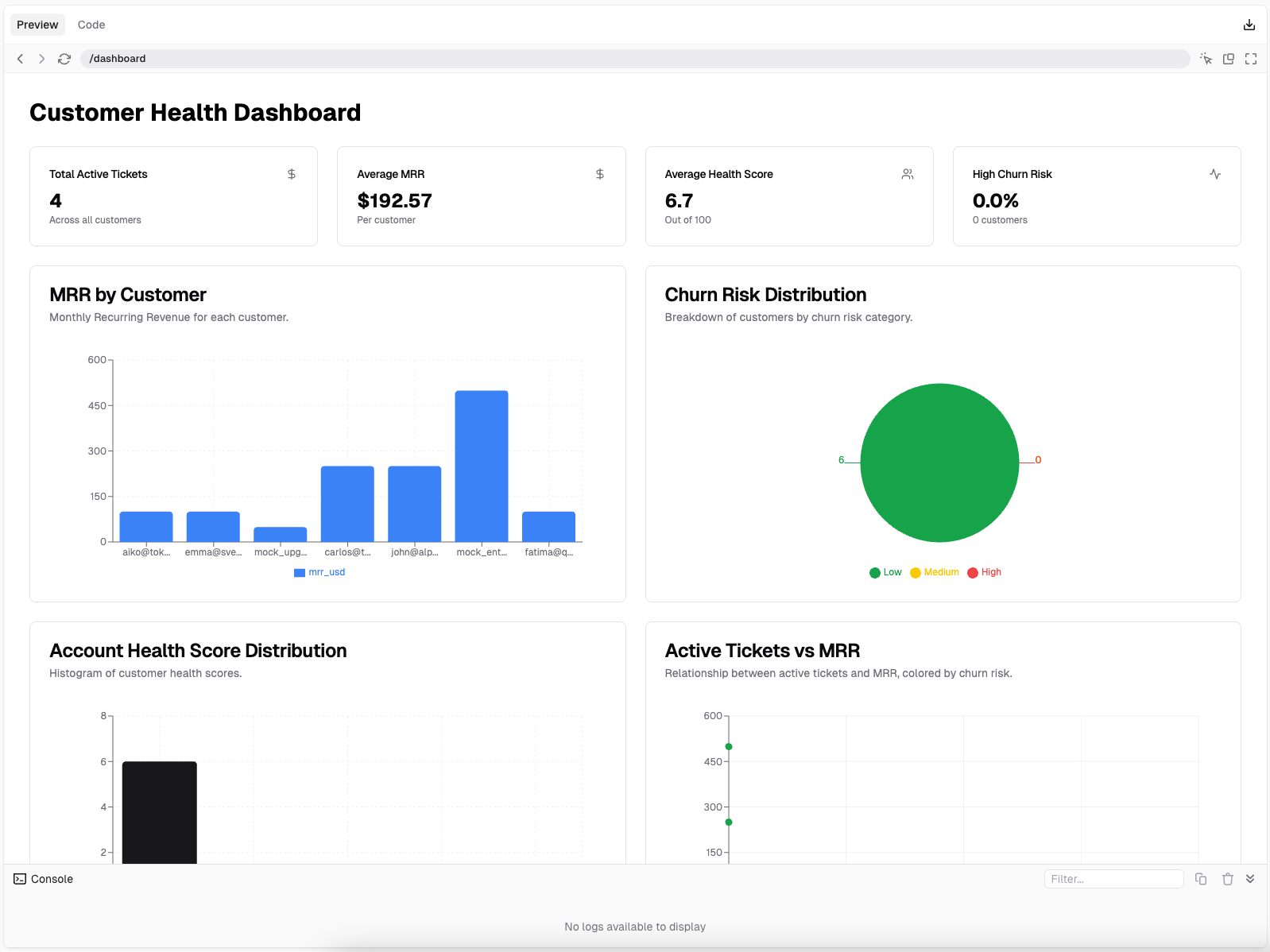
1. Active Tickets
This query shows how many active support tickets (with statuses “open” or “pending”) each user has created in the past 30 days. It helps identify users who may need more urgent support.2. Monthly Recurring Revenue (MRR)
This query calculates the monthly recurring revenue (MRR) per customer by summing up the unit amounts of active or recently incomplete subscriptions. Useful for understanding current revenue flow.3. Churn Risk
This query identifies customers who have recently submitted a high number of support tickets and cross-references them with their subscription activity to assess churn risk levels.4. Account Health Score
This query calculates a composite health score for each customer by combining their active subscription status, recent open tickets, and churn risk level. The score helps prioritize accounts needing attention.Step 4: How to Build the Dashboard on v0.dev
Once your queries are ready on Peaka, the next step is turning them into a full-stack dashboard UI. This section explains how to use v0.dev, an AI tool that generates production-grade UIs from prompts, to build a fully responsive dashboard with zero boilerplate. Here’s how to go from saved queries to a fully functional customer health dashboard:Write the Prompt for v0.dev
Begin by preparing a detailed prompt that describes your goal. Here’s an example prompt you can adapt:Set Up Environment Variables
After generating the UI, v0 will request environment variables for secure access to your Peaka project. Add the following to your.env file:
 These values are injected into your app and used when making authenticated
 fetch calls to Peaka’s Data API.
Verify API Calls and Response Handling
v0 generates initial API logic based on your prompt. To ensure accuracy:- Review how
fetchrequests are constructed (especially the body structure) - Compare it with Peaka’s API documentation
- Add sample request and response objects from the docs directly into your prompt (if needed) to improve alignment
catalogName, schemaName, and tableName, these need to be exactly as defined in your Peaka query setup.
Make Final Adjustments
Once the initial dashboard is generated:- Refine how response data is parsed into metrics and chart series
- Tweak chart components (tooltips, colors, legends, bucket logic)
- Adjust layout and spacing using Tailwind utility classes
- Simplify or restructure component logic for maintainability
Within minutes, you’ll have a live, responsive, developer-friendly customer health dashboard, powered by real-time data from Peaka and built entirely through prompt-driven development.
Real-World Use Cases
Different roles across a company can benefit from these metrics in meaningful ways. For instance, a Customer Success Manager might regularly track Account Health Scores and Active Tickets to prioritize accounts that need immediate attention or proactive engagement. If an account shows a declining health score and an increasing number of unresolved tickets, it’s a clear signal to intervene before churn becomes inevitable. On the other hand, a Revenue Manager could use MRR data to analyze revenue growth trends and identify which customer segments are driving the most value. By tying this insight with churn risk data, he/she can spot weak points in the customer journey and collaborate with other teams to improve retention. Meanwhile, Product Teams can look at churn-prone accounts to understand usage patterns, or the lack thereof. If many of the accounts with high churn risk share a common behavior (e.g., not using a key feature), it becomes a product insight that could inform roadmap priorities or onboarding improvements. And of course, Executives benefit from seeing the bigger picture, how health scores, support loads, and revenue trends correlate across the business. Having these metrics aggregated and visualized in one place enables faster, more informed strategic decisions.Before Peaka and v0.dev: The Legacy Approach
Before tools like Peaka, tracking customer metrics across Stripe and other platforms meant stitching together multiple data sources manually. To calculate metrics like MRR or active support tickets, teams often relied on:- Exporting CSVs from Stripe, Intercom, and Jira
- Writing custom SQL scripts in local notebooks or BI tools
- Setting up and maintaining pipelines to sync these exports into a central database
- Using spreadsheet formulas to aggregate or visualize key numbers
- Time-consuming: Writing and maintaining queries required technical expertise.
- Error-prone: Each manual export introduced chances for mismatched data or outdated snapshots.
- Hard to scale: As the number of metrics or tools increased, keeping everything in sync became a full-time job.
- Poorly democratized: Business and support teams had to wait for engineers or analysts to fetch the numbers they needed.
Key takeaways
- With v0 and Peaka, you can build customer dashboards from natural language prompts, no coding or manual setup required.
- Peaka brings data from multiple platforms into one place, eliminating the need for custom pipelines or integrations.
- Teams like Customer Success, Product, and Account Management can monitor churn risk, MRR, and ticket activity in real time.
- By replacing spreadsheets and scattered tools, Peaka creates a single source of truth for customer health metrics.